Copy
Intent design system

The Logo
Motion
Twist
Bloom
Pulse
Combination on background
Color
Our palette pairs a warm neutral foundation with a focused citrus accent. Semantic tokens connect those foundation colors to their purpose in the interface.
Core
Yellow 200--color-yellow-200
#C0CC54
Yellow 300--color-yellow-300
#D3DE5D
Yellow 500 - Primary--color-yellow-500
#DDEC61
Yellow 700--color-yellow-700
#FEF99D
Yellow 800--color-yellow-800
#FFFFC7
Yellow 900--color-yellow-900
#FCFCF9
Black--color-black
#080808
Grey 50--color-grey-50
#161616
Grey 100--color-grey-100
#1A1A19
Grey 200--color-grey-200
#272727
Grey 300--color-grey-300
#3D3D3C
Grey 400--color-grey-400
#525250
Grey 500--color-grey-500
#8C8C89
Grey 600--color-grey-600
#BABAB7
Grey 700--color-grey-700
#CFCFCD
Grey 750--color-grey-750
#D9D9D9
Grey 800--color-grey-800
#E1E1DE
Grey 850--color-grey-850
#E5E5E5
Grey 900--color-grey-900
#F0F0EB
White--color-white
#FFFFFF
Secondary
Moss 400--color-moss-400
#717453
Moss 500--color-moss-500
#979A73
Orange 500--color-orange-500
#FAA755
Red 500--color-red-500
#E87F39
Surface
Canvas--color-canvas
--color-grey-900 (#F0F0EB)--color-grey-50 (#161616)
Surface--color-surface
--color-white (#FFFFFF)--color-grey-200 (#272727)
Muted surface--color-surface-muted
--color-grey-800 (#E1E1DE)--color-grey-100 (#1A1A19)
Inverse surface--color-inverse-surface
--color-black (#080808)--color-white (#FFFFFF)
Control (Component Surface)
Control surface--color-control-surface
--color-white (#FFFFFF)--color-grey-200 (#272727)
Muted control surface--color-control-surface-muted
--color-grey-900 (#F0F0EB)--color-grey-50 (#161616)
Active control surface--color-control-surface-active
--color-grey-900 (#F0F0EB)--color-grey-300 (#3D3D3C)
Strong control surface--color-control-surface-strong
--color-grey-800 (#E1E1DE)--color-grey-300 (#3D3D3C)
Inverse control surface--color-control-surface-inverse
--color-grey-100 (#1A1A19)--color-grey-300 (#3D3D3C)
Control edge--color-control-edge
--color-grey-700 (#CFCFCD)--color-grey-300 (#3D3D3C)
Control thumb--color-control-thumb
--color-white (#FFFFFF)--color-grey-500 (#8C8C89)
Control ink--color-control-ink
--color-black (#080808)--color-grey-900 (#F0F0EB)
Text
Content--color-content
--color-black (#080808)--color-grey-900 (#F0F0EB)
Muted content--color-content-muted
--color-grey-400 (#525250)--color-grey-600 (#BABAB7)
Inverse content--color-inverse-content
--color-grey-900 (#F0F0EB)--color-black (#080808)
Fixed dark content--color-content-fixed-dark
--color-black (#080808)--color-black (#080808)
Fixed light content--color-content-fixed-light
--color-grey-900 (#F0F0EB)--color-grey-900 (#F0F0EB)
Logo--color-logo
--color-content-fixed-dark (#080808)--color-content-fixed-dark (#080808)
Border
Border--color-border
--color-black-10 (rgb(0 0 0 / 10%))--color-white-10 (rgb(255 255 255 / 10%))
Strong border--color-border-strong
--color-black-15 (rgb(0 0 0 / 15%))--color-white-15 (rgb(255 255 255 / 15%))
Solid border--color-border-solid
--color-grey-850 (#E5E5E5)--color-grey-300 (#3D3D3C)
Strong solid border--color-border-solid-strong
--color-grey-750 (#D9D9D9)--color-grey-400 (#525250)
Focus ring--color-focus-ring
--color-black (#080808)--color-accent (#DDEC61)
Accent
Accent--color-accent
--color-citrus (#DDEC61)--color-citrus (#DDEC61)
Secondary accent--color-accent-secondary
--color-moss-500 (#979A73)--color-moss-500 (#979A73)
Tertiary accent--color-accent-tertiary
--color-moss-400 (#717453)--color-moss-400 (#717453)
Alert accent--color-accent-alert
--color-red-500 (#E87F39)--color-red-500 (#E87F39)
Gradients
Work in progress gradients, used for subtle backgrounds and surfaces, and complimentary to flat colors. Don't overuse.
Light Grey To Yellow
Medium Grey to Yellow
Grey To Yellow
Yellow Wash
Yellow To Grey
Light Yellows
Typography
ABC Arizona Mix gives headlines their expressive shape, while Inter keeps interface and supporting copy direct and readable.
ABC Arizona Mix
ABCDEFGHIJKLMNOPQRSTUVWXYZ
abcdefghijklmnopqrstuvwxyz
1234567890!@#$%^&*()
Inter
ABCDEFGHIJKLMNOPQRSTUVWXYZ
abcdefghijklmnopqrstuvwxyz
1234567890!@#$%^&*()
Large-scale agent coordination.
Large-scale agent coordination.
Large-scale agent coordination.
Large-scale agent coordination.
Large-scale agent coordination.
Large-scale agent coordination.
Large-scale agent coordination.
Large-scale agent coordination.
Large-scale agent coordination.
Large-scale agent coordination.
Large-scale agent coordination.
Large-scale agent coordination.
Large-scale agent coordination.
Large-scale agent coordination.
Large-scale agent coordination.
Large-scale agent coordination.
Large-scale agent coordination.
Large-scale agent coordination.
Large-scale agent coordination.
Large-scale agent coordination.
Large-scale agent coordination.
Large-scale agent coordination.
Large-scale agent coordination.
Large-scale agent coordination.
Iconography
Functional icons are derived from the language of the mark: rounded corners with flat caps. They are set in a 192px grid at 16px thickness, meaning at 16x16px they use a 1.33px thickness. At 12x12px, stroke thickness isn't scaled down, rather forms are reduced and simplified.


Foundations
Corner radii, margins, control sizes, and elevation. These are the measurements every surface, control, and layout in the system is built from. Corner radii and margins are tokens in global.css and wired through the components; sizes and elevation are still set per component.
Corner radii
XS--radius-xs
5px
S--radius-s
10px
M--radius-m
15px
L--radius-l
20px
XL--radius-xl
25px
2XL--radius-2xl
45px
Margins
5px--space-5
5px
10px--space-10
10px
15px--space-15
15px
20px--space-20
20px
25px--space-25
25px
40px--space-40
40px
60px--space-60
60px
80px--space-80
80px
Sizes (buttons)
XSno token yet
35px
Sno token yet
40px
Lno token yet
60px
XL — circular onlyno token yet
90px
Elevation
Drop shadowno token yet
Y10, blur 20
Components
Reusable interface pieces currently available in the Astro site. Detailed component layouts and usage guidance will follow.
Buttons
Color
Size
Variant
State
Tooltip
Dropdown
Color
Size
List
Item icon
Margin
Position
State
Model switcher
Color
Models
Tabs
Color
Size
Variant
Amount
Combo Button
Variant
Size
Color
Amount
State
Switch
Size
Color
Slider
Color
Label
Size
Handle
Editable value
Checkbox
Size
State
Form field
Color
Size
State
Icon
Tooltip
Variant
Placement
Copy
Copy
Copy
Context menu
List
Item icon
Side navigation
List
Color
Width
Eyebrow
SegmentedControl.astro
IconControl.astro
IntentIcon.astro
Mark.astro
SystemIcon.astro
Platform icons
AppleIcon.astro · GithubIcon.astro · WindowsIcon.astroLogoAnimation.astro
Navigation.astro
SectionNav.astro
ApplicationSurface.astro
Reusable application surface
ApiKeyPolicy.astro
ConversationMessage.astro
ApplicationAgentComposer.astro
ApplicationAgentPanel.astro
 Agent preview

can you run this locally?
I'll inspect the project's local run instructions, then start the appropriate development process and report the URL or app status.
 Name the workspace and agent for running the app locally
 Read SKILL.md /Users/ameilawattenberger/intent/workspaces/morning-penguin/cloudlands-fe/.agents/skills/electron
The repository provides a standalone mock backend fallback, so I can start it without a daemon.
 Run pnpm run dev
Run terminal 18297
Blocked on dependencies
pnpm run dev exited with code 1 because and the
May I run pnpm install, then restart the app?
Yes
ApplicationAgentThread.astro
can you run this locally?
I'll inspect the project's local run instructions, then start the appropriate development process and report the URL or app status.
Name the workspace and agent for running the app locally
Read SKILL.md /Users/ameilawattenberger/intent/workspaces/morning-penguin/cloudlands-fe/.agents/skills/electron
The repository provides a standalone mock backend fallback, so I can start it without a daemon.
Run pnpm run dev
Run terminal 18297
Blocked on dependencies
pnpm run dev exited with code 1 because and the
May I run pnpm install, then restart the app?
Yes
ApplicationPanelCopy.astro
Add Interactive Maplogistics-ai/app
ApplicationPanelToolbar.astro
ApplicationPanelGroup.astro
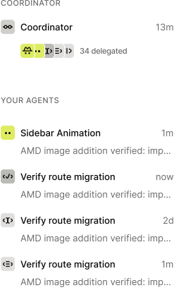
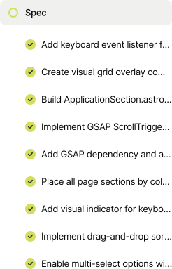

ApplicationCardUI.astro
Add Interactive Maplogistics-ai/app

Redoing the Figma deliverable from live web-app imports, then promoting repeated UI into real components and variants.
ApplicationAnimationsAgentContent.astro
ApplicationAnimationsBrowserContent.astro
01Electronics1,842962,240
02Motors68412864
03Hydraulics74254955
04Sensors1,261641,555
05Pneumatics1,120481,392
ApplicationInteractiveMapSpecContent.astro
The Live Map must read as a polished, production-grade dispatcher console — not a map with widgets bolted on. Every surface is measured against the Figma design.
Fidelity Checklist
- Color palette (brand, status: en route / arriving / delivered / delayed, neutrals, map-tinted surfaces) encoded as tokens.
- Type scale (font family, sizes, weights, line-heights, letter-spacing) matches Figma; correct web fonts loaded with fallbacks.
- Light theme complete; dark/map-dark surface tokens defined
- Icon set matches Figma (size, stroke, optical alignment)
- Zoom control disabled state at min/max zoom rendered per design.
- Destination pin variants (active, arriving, delivered, delayed)
- Dropped pin has its own styled variant + drag affordance.
- Status badges use correct status color tokens
- Loading skeletons/empty states for rail and card match design.
- Contrast (WCAG AA) verified for text/markers over the map at multiple zoom levels.
FluidSurface.astro
FullCycleFeatureGraphic.astro
Context-bound components
These components require a page controller, viewport layer, external target, or full-page layout.
AgentResponseGui.astroAlternateApplicationSection.astroApiSettingsOverlay.astroApplicationSection.astroFluidDevPanel.astroFooter.astroGridOverlay.astroSpecwriterApp.astroSpecwriterLiquid.astro
All components (54)
AgentResponseGui.astroAlternateApplicationSection.astroApiKeyPolicy.astroApiSettingsOverlay.astroAppleIcon.astroApplicationAgentComposer.astroApplicationAgentPanel.astroApplicationAgentThread.astroApplicationAnimationsAgentContent.astroApplicationAnimationsBrowserContent.astroApplicationCardUI.astroApplicationInteractiveMapSpecContent.astroApplicationPanelCopy.astroApplicationPanelGroup.astroApplicationPanelToolbar.astroApplicationSection.astroApplicationSurface.astroButton.astroCheckbox.astroCodeBlock.astroComboButton.astroContextMenu.astroConversationMessage.astroDropdown.astroFluidDevPanel.astroFluidSurface.astroFooter.astroFormField.astroFullCycleFeatureGraphic.astroGithubIcon.astroGridOverlay.astroIconControl.astroIntentIcon.astroLogoAnimation.astroMark.astroMediaCarousel.astroModelSwitcher.astroNavMark.astroNavigation.astroSectionNav.astroSegmentedControl.astroSlider.astroSpecwriterLiquid.astroSwitch.astroSystemIcon.astroTabs.astroTooltip.astroUpdateVideo.astroWindowsIcon.astrofeatures/FeatureAccordion.astrofeatures/FeatureCarousel.astrofeatures/FeatureCopy.astrofeatures/FeatureMedia.astrofeatures/HomepageFeaturePreview.astro